Why Gestalt Principles Still Matter
in the Age of AI and No-Code.
Gestalt Principles
‘AI’ is an overused term today. In an era of AI-generated layouts and no-code tools, why should designers care about century-old psychological theory?
Because Gestalt is about humans, not pixels.
Your tools and layout builder might generate a sleek card component, but they will not tell you whether those same cards are being grouped correctly in the user’s mind. Tools (yet) cannot perceive cognitive load, emotional coherence, or visual storytelling (does not “understand” as humans, relies on pattern recognition). Gestalt principles bring that layer of empathy back into design.
They ask: How does this make someone feel? Where will their eyes go? What assumptions will they make?
Designers who understand that, wield a superpower.
Gestalt principles are the silent architects of clarity, emotion, and usability in modern web design. They are not academic ideas – they are how people actually see.
In a world where attention is currency, and information overwhelms, the websites that win are not necessarily the flashiest – they are the ones that feel like home to the human brain.
So, what are Gestalt Principles?
The term “Gestalt” is German for “shape” or “form,” but it really means that the “whole is greater than the sum of parts.” Simply put, these principles describe how we humans naturally organise visual elements into groups when certain rules are applied.
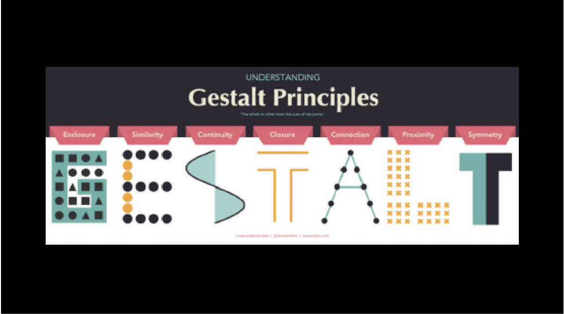
While there are many, we can understand the seven core principles commonly referenced in web or internet design.
- Proximity
- Similarity
- Continuity
- Symmetry
- Closure
- Figure/ Ground
- Common Fate.
Let’s break these down with simple real-world examples used in modern everyday web design.
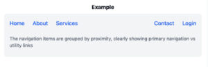
- Proximity: Grouping Through Space
The principle of proximity states that elements that are placed close together are perceived as related, even if they are different in shape, size, or colour.
This simple spatial relationship can create powerful organisation cues without the use of borders or explicit groups.
- Similarity: Visual Consistency for Clarity
When we use consistent shapes, sizes or colours, it signals that certain elements below together or serve similar functions.
Consistency breeds trust.
The visual consistency helps users quickly identify navigation menus, buttons and related content, reinforcing the intended hierarchy and making navigation intuitive.

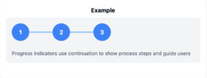
- Continuity: Guiding the Eye
The principle of continuity suggests that the eye naturally follows paths, lines and curves, preferring smooth, continuous flows over abrupt changes.
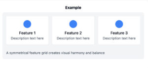
- Symmetry: The Pursuit of Simplicity
Humans prefer balanced simple layouts as they appear more harmonious.
Simplicity is not about removing content but organising it so the mind can process it effortlessly. As digital products become more complex, the demand for visual clarity and order is growing.
E.g. The Olympic rings logo is simple and interpreted as interlocking circles and not a jumble of shapes.
- Closure: The Power of Suggestion
Closure is the mind’s ability to perceive and complete an image even when parts are missing, filling in the gaps to create wholeness. This principle allows designers to suggest shapes or ideas without fully rendering them.
Leaving things unsaid can engage users’ imagination and attention.
Strategic use of closure can make interfaces feel lighter, more modern, and even playful.
E.g. The iconic WWF panda logo is made of black shapes with gaps, but our minds instinctively recognise the animal.

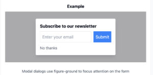
- Figure/Ground: Focus and Depth
The Figure/Ground principle describes how we distinguish a focal object (figure or foreground) from its background (the ground or supporting elements). The effective use of figure/ground creates emphasis, depth and clarity.
Designers can shift focus contextually, guiding users step-by-step through complex tasks or highlighting urgent information.
E.g. When a modal window opens and the rest of the site fades, the modal becomes the figure, commanding attention. Netflix’s video player – the play button stands out against the dark background, drawing immediate attention.
- Common Fate: Movement in Unison
Elements moving in the same direction are perceived as related.
FAQ sections frequently use downward-pointing arrows or animation to group related questions and answers, signalling that these elements move together.
Conclusion
Good design is invisible, but perceived. It feels right even before it is analysed. The “right” feeling often stems from how well the design aligns with how our minds naturally organise what we see.
If you found this helpful, ask yourself:
- Does my website layout follow Gestalt Principles?
- Where could small tweaks improve usability?
- How can I test these concepts with real users?
By applying these principles thoughtfully, you can create more intuitive, visually appealing and effective web designs that stand out in today’s digitally crowded landscape.
Gestalt principles are the designer’s compass – guiding users not just to see, but to feel, understand, connect and act.